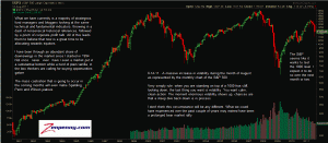
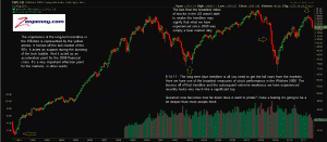
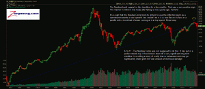
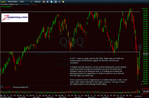
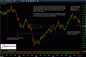
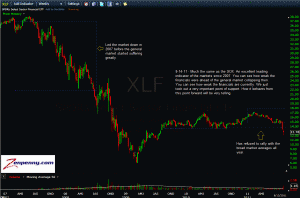
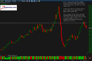
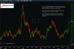
The story this week is in the long-term charts for most market averages. That’s where I am looking this week. That’s where the real story of the market is told presently. I could dissect the daily charts, but I think they are generally useless given the volatility we have faced. Investors need to zoom out to get the real story. Smooth out the recent volatility. That’s exactly what I’m doing. Enjoy:
click charts to enlarge

