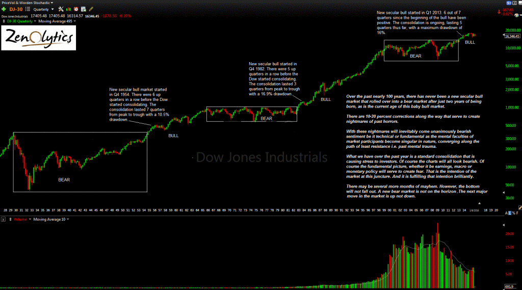
Let's put aside the the multi-month time frame for the market just for a second and focus on the really big picture. This is a good exercise for the simple purpose of maintaining focus, which is a sorely needed attribute among modern market participants.
I presented the chart below in January as a means of assuaging the then persuasive fears of a secular bear market. According to the very simple chart below going back nearly 100 years, the markets are in a powerful secular bull market that really just started recently.
With that said, there are going to be numerous corrections (you can even call them cyclical bear markets) between 10 to 20 percent that convince market participants of an impending secular bear market that is both long-lasting and deeper than 25% from peak to trough. We, in fact, just had one. And it worked perfectly in that it completely threw market participants for a loop, causing all varieties of sordid analysis of the septic variety that were more or less a product of fear rather than facts.
click chart to enlarge
What is important to note about the evolving ecology of the markets over the past 100 years is that secular bears have become progressively shorter in duration while secular bull markets have become progressively longer in duration. There are probably multiple reasons for this, most of which has to do with the involvement of central banks and evolving liquidity experiments.
Given this evolving pattern is it too far off to believe that this secular bull may last longer than anybody expects? The last secular bull market lasted about 17 years give or take. The one before that about 10 years.
Is it unfair to assume that the unintended consequences of what is really the first global concerted effort at providing liquidity at any cost will be a progression of asset prices along both time and scope of returns?
According to the chart above, it is not out of the realm of possibility and is in fact, very likely.

