A REMINDER: CHARTS ARE BEING USED TO KILL YOU
There is a disease that has been unleashed amongst the investment community. It doesn't discriminate along the lines of experience level, income or how nice of a person you feel you are. It's the garbage disposal of the investment business. Sucking capital in, chopping it up and sending it into the sewer system to serve as a floatation device for rodents.
Charts or technical analysis are turning otherwise decent fund managers and investors into mouth breathing, hyperactive reptilian creatures who cannot get out of their own way. Consistently being wrong on Wall Street has been known to lead to shape shifting, sudden outbursts and uncontrollable twitching. All of which can be witnessed on any street in Manhattan or Greenwich several times a day.
There's a very simple rule on Wall Street. It goes into the DNA of the financial markets. When a majority of market participants use the same methods in an attempt to extract a short to intermediate term profit, not only will that methodology cease to function properly. Rather, the methodology will begin a process of self-cannibalization of sorts. It will turn into a tool for the devouring of market participants rather than a tool for profit.
It is no secret that nearly every active market participant is looking at the same technical levels, same moving averages and same patterns. Drawing the same conclusions from the charts they observe. This won't work. It will hurt you. In fact, it will kill you. And we're all guilty of it.
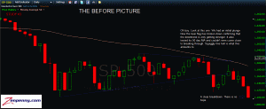
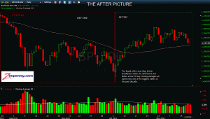
A reminder along with some illustrations of the fact that technical analysis alone will kill you.
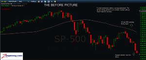
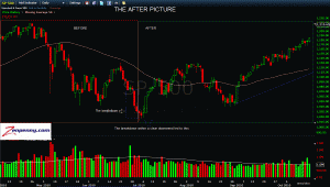
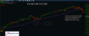
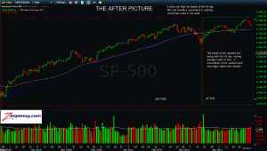
There are three recent examples of death by chart below. Before and after images provided for clarity:
STUDY #1 - THE DEATH STAR
STUDY #2 - THE AVALANCHE
STUDY #3 - THE P.T. BARNUM


